In this activity, students use digital software and data analysis skills to create an infographic interpretation of your school’s Your Move Hands Up Survey data.
Download the lesson plan below.
Year level: 6-10
Learning Outcomes:
After completing this activity, students will be able to:
- Maths: Interpret and compare data displays Hands Up Survey data sets collected through the school’s Your Move profile;
- Maths: Use critical and mathematical thinking to effectively analyse the data, draw conclusions from it and summarise key patterns and relationships within it.
- Digital Technologies: Evaluate and visualise data, using a range of software, to create information, and use structured data to model objects or events.
- HASS: Consider the factors that influence student travel behaviour (e.g. distance from school, parental time pressure, accessibility, cost, geography, safety) and how these might impact the data sets;
- HASS: Reflect on learning to determine actions that may improve active travel outcomes at the school.
- Health and Physical Education: Consider social, economic and environmental factors that influence health
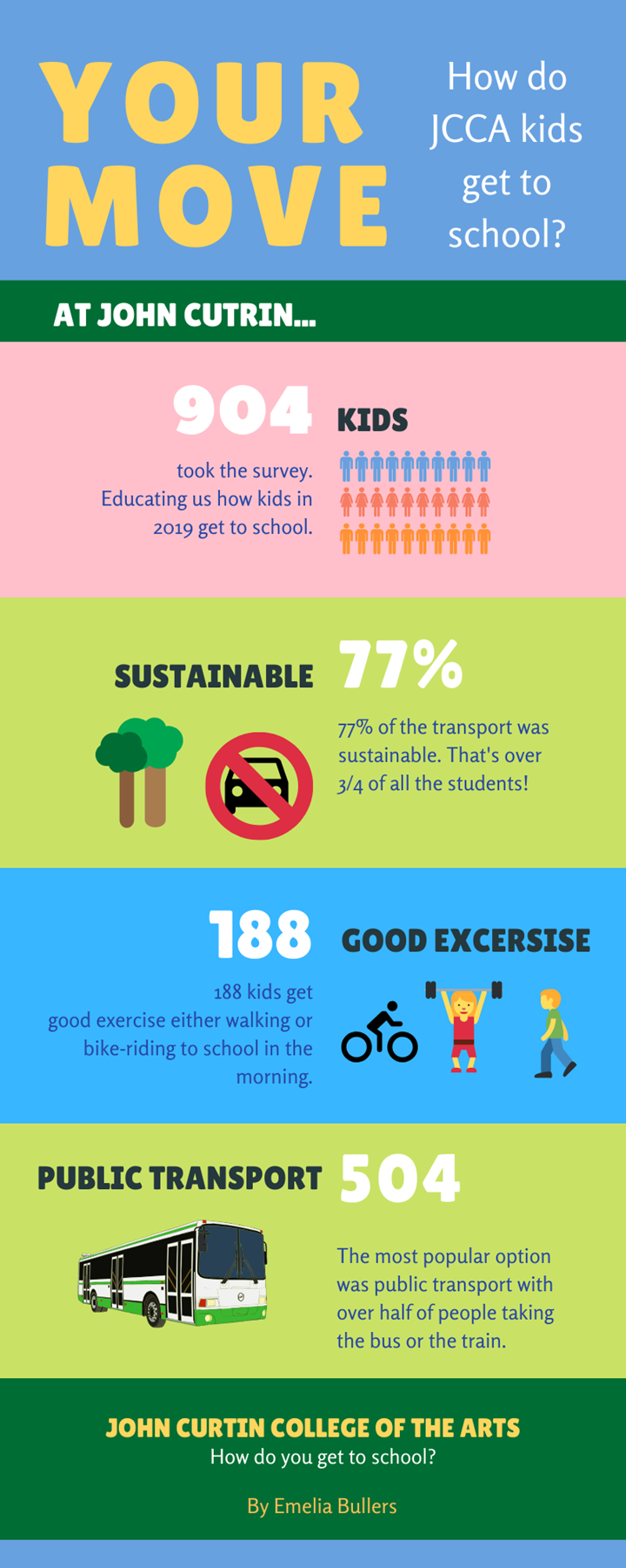
An example infographic created by a student from John Curtin College of the Arts