79
As an Analyst by profession, I thought it would be great to share my skills with the Yr 6 your move team and undertake the "Create an Infographic" classroom activity using the hands up survey data from our recent hands up survey.
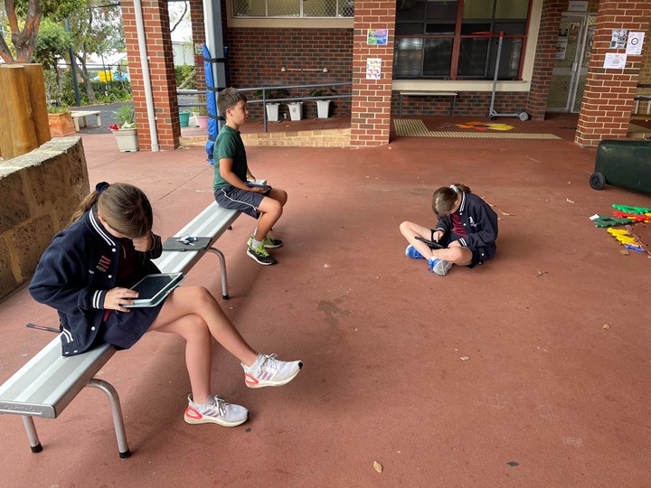
Each student brought their iPad and we sat in the outdoor undercover area to run the lesson. We used the John Curtin College of the Arts infographic as an example. I sent a link of the activity to each student so that they were able to see on their devices what the goal of the activity was. https://www.yourmove.org.au/resources/create-a-your-move-infographic-high-school-teaching-and-learning-resource/
We looked at the JCCA infographic and decided which measures we would need to calculate to create a St Augustine's infographic.
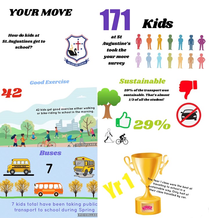
- Total students who took the survey
- Total students who had walked or ridden
- Percentage of students who had used sustainable transport
- Total students who had used public transport
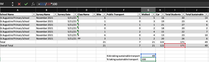
I downloaded the data to excel and shared the file to each of the students. I showed the students how to write a formula using MS Excel's SUM function to create a total of the inputs. Together we used the SUM function to find the total of students who took the survey in each class, and then again to find the total of all of the classes. The students were amazed at the power and speed of functions in Excel. I then challenged the students to find the total of students who had walked or ridden and the total of the students who had taken public transports to school using the SUM function on their own. It was fantastic to see how quickly the students picked up their new skill.
We were able to take the challenge a step further when we needed to calculate the percentage of students who had used sustainable transport. Firstly we needed to define 'sustainable transport'. The group agreed that all modes of transport, excluding car was sustainable transport. We used the SUM function again to total all sustainable travel students.
We also needed to agree on the formula to calculate a percentage. Using some simple examples of 'imagine if we had 100 of something and 50 of them were special, what percentage are special?' the group agreed that 'the number of things divided by the total of things times 100' was the way to go for a percentage calculation. As we wrote this into the formula bar in Excel we re-iterated the mantra 'number divided by total times 100'.
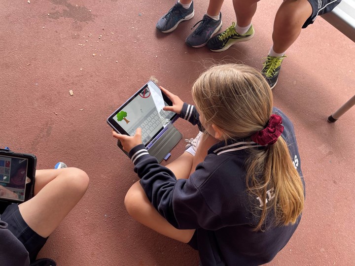
Once we had all of our measures, it was time to get to work creating the infographic. The team decided that the best way to tackle the problem was if each student took a measure and created their own part of the infographic and then they could bring it all together at the end. They negotiated between themselves and agreed to use the same font for each section. Using pic collage they were able to bring together some great graphics.
Some students had finished their contribution ahead of the rest of the team - so I offered them a challenge. How about finding the most sustainable class? We worked through the problem together and calculated the percentage sustainable for each class individually by calculating 'number divided by total times 100' for each class.
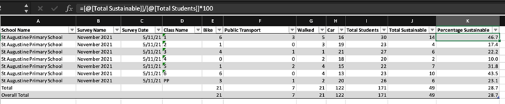
The Year 1 class came out on top, with almost half of their students travelling to school in a sustainable way. A quick graphic to represent our new measure and we were ready to collate all of the graphics into one infographic!
Once the images were collated, we asked our lovely admin team to assist us to print these into A3 posters to place around the school. This was a great activity to do with the Yr 6 team, celebrating the results of their impact on sustainable transport for the school in 2021 into a simple infographic to display for the school to see. It was enjoyable to share my expertise with the students and open their eyes to a career option that none of them had heard of before. I look forward to doing this activity again next year with the next your move team. Maybe next year we will look at publisher or powerpoint rather than pic collage as the pic collage had its limitations in the final presentation.
This story is related to Classroom Activity: Create a Your Move Infographic
For more information on how to do this, click hereDiscuss this story
2 Comments
Please login to comment
James (Your Move)
What a fantastic activity Lindi - so great that you could open the kids' eyes to another career option, introduce them to Excel and get some wonderful infographics published. You have earned 25 points for the activity, a big 30 points for the super level of detail you have shared and a final 5 points for sharing your lesson learned regarding the software choice.
Report commentLindi
Thank you James!
Report comment